Hotel Booking Flow
This case study was completed as part of a UX design exercise for a global travel platform. Acting as the Senior Product Designer, I was responsible for auditing the hotel booking flow with a focus on identifying usability issues and proposing improvements. The project was carried out over the course of one week, using tools such as Figma, FigJam, Notion and Miro to support research, ideation and prototyping.
- UX Audit, March 2025
Research
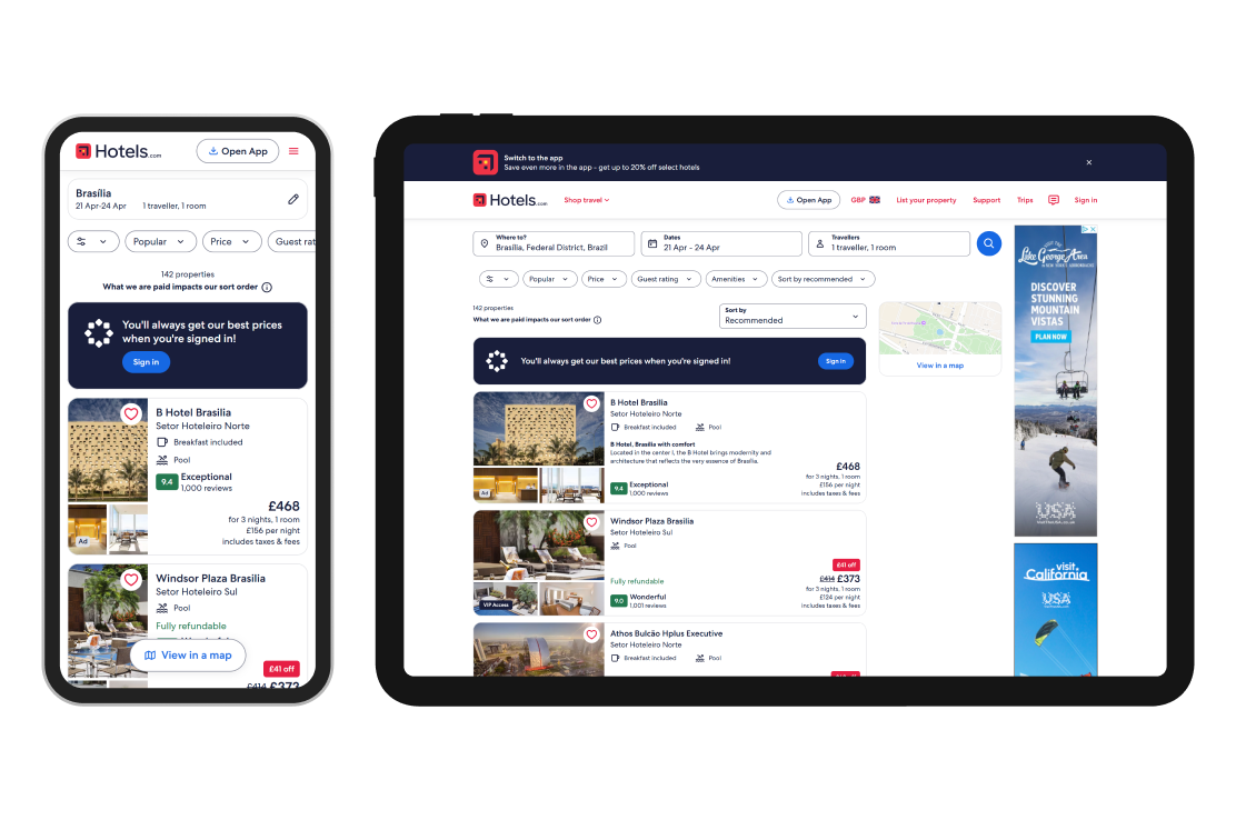
This project involved evaluating the hotel booking flow within a digital platform designed for business travellers. The aim was to identify usability issues across the entire journey, from the homepage through to the final itinerary. I approached the task as a typical user who needed to book accommodation for an international client visit, taking into account both personal preferences and company travel policy.
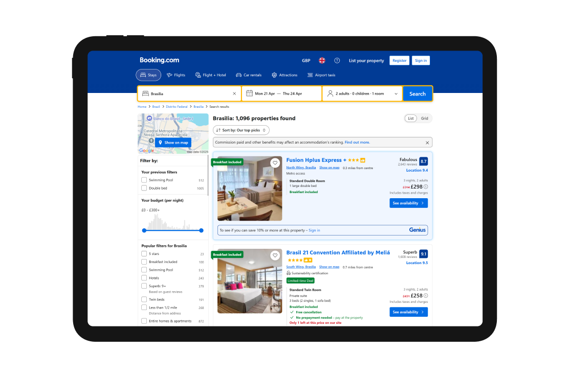
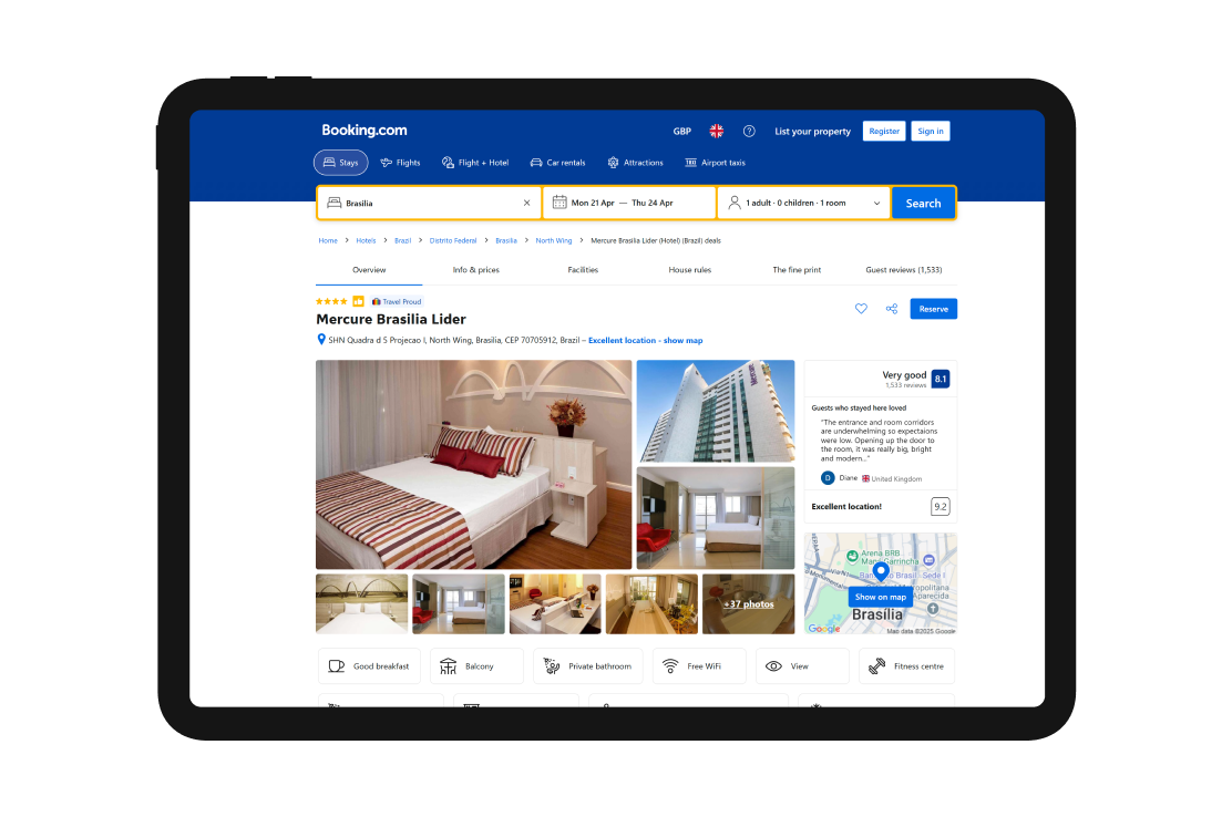
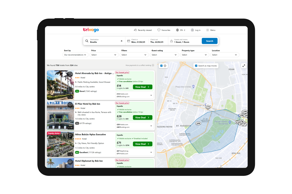
To begin the audit, I carried out a heuristic evaluation based on recognised usability principles and compared the experience with several well-known platforms in the travel industry, including Booking.com, Trivago and Expedia. The review uncovered a number of usability challenges within the current flow. These included a cluttered interface, inconsistent filtering behaviour, and a lack of early visibility into travel policy compliance. Certain transitions between steps also felt disjointed, making the experience more confusing than necessary and reducing user confidence in the outcome.
Personas
To focus the evaluation, I created a persona named Emma, a Senior Account Manager at a global technology company. Emma regularly travels to meet clients and must ensure her bookings follow internal travel policy. For this particular journey, she was seeking a hotel that was close to the client's office, with strong guest reviews, a swimming pool, and a queen or king-sized bed.
Emma is busy and often multitasking, which makes efficiency and clarity essential. Her main frustrations include overly complex booking systems, unclear hotel details, and wasting time reviewing options that do not meet her preferences or company policy. She wants a straightforward experience that allows her to make quick decisions with confidence.

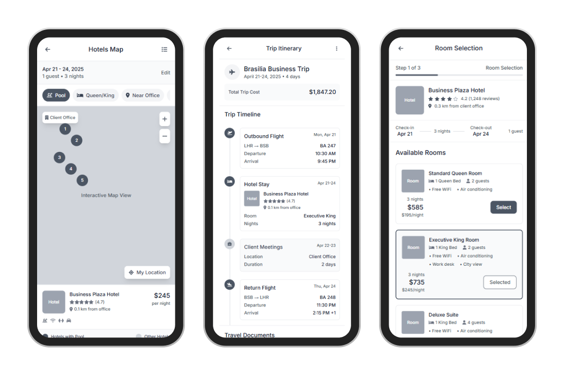
Userflow (Current Experience)
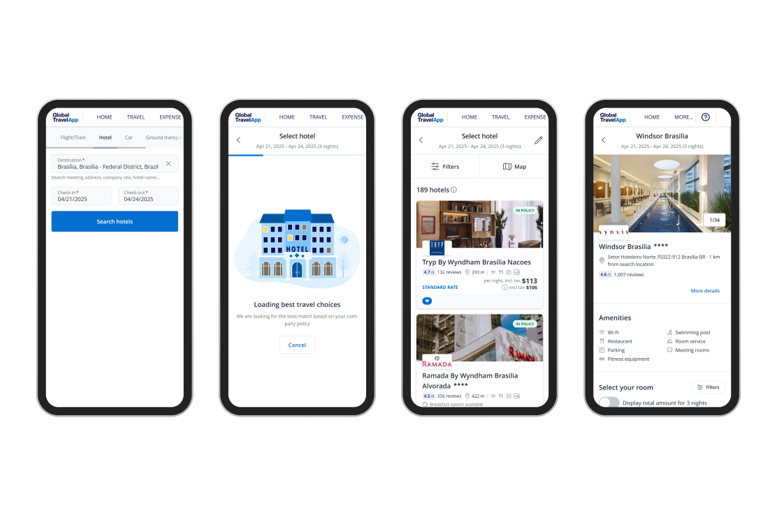
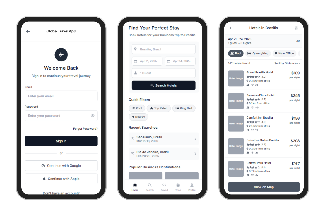
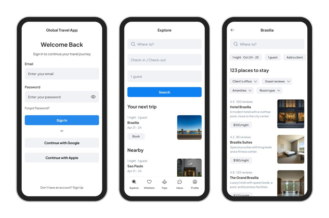
The booking journey started at the homepage and progressed through trip overview, hotel search, filter options, hotel details, room selection and itinerary review. While this structure followed a logical order, the execution led to several pain points. Filters would reset or become hidden when moving between pages, causing users to repeat actions unnecessarily. Policy compliance indicators were presented too late in the journey, leading to time spent reviewing unsuitable options. In addition, critical information such as bed type or distance from the client's location was not always easy to access or compare between listings.
Concepts
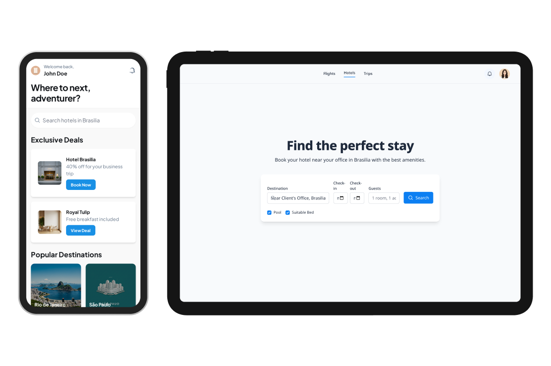
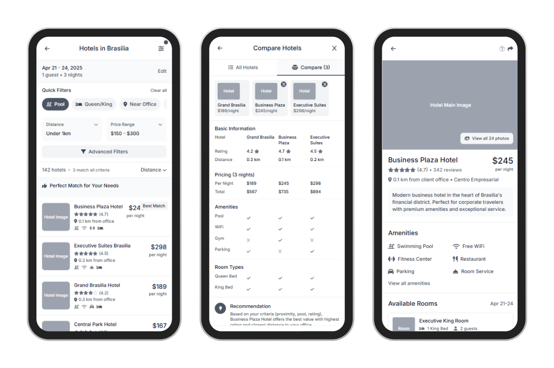
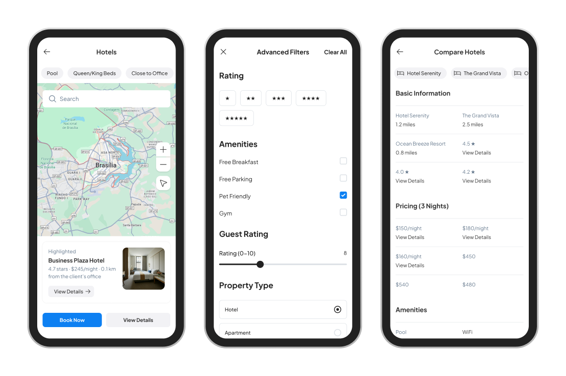
To resolve these issues, I proposed several targeted improvements aimed at increasing clarity, efficiency and alignment with business needs. One of the main ideas was to introduce a persistent filter panel that would remain visible throughout the process. This would allow users to set essential criteria, such as travel policy rules, amenities, bed preference and proximity to a specific address, right at the beginning.
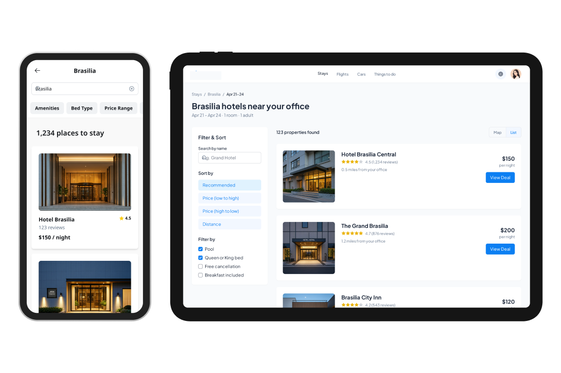
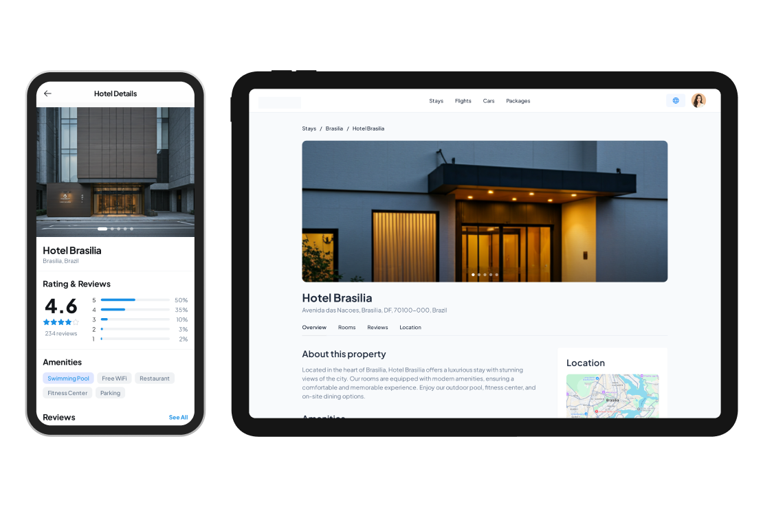
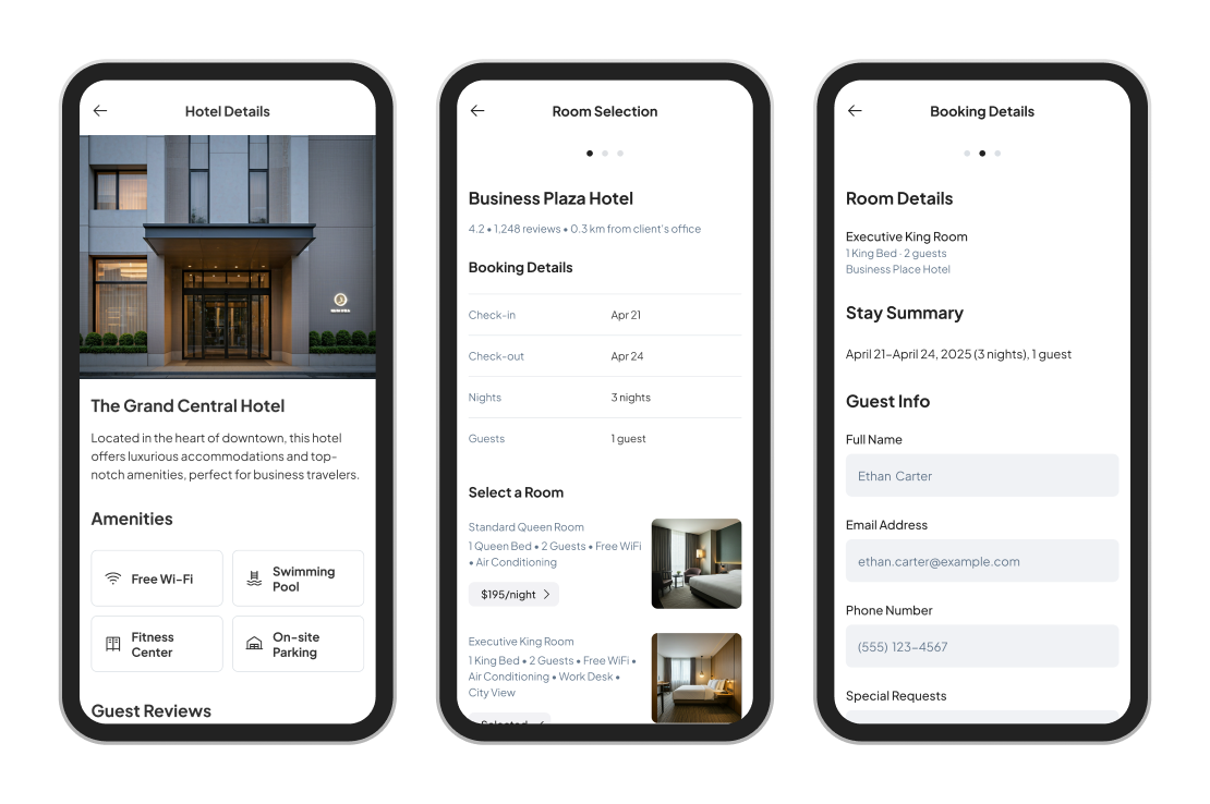
I also redesigned the hotel listing cards to display high-priority information at a glance. Each card featured large images, clear star ratings, distance from the meeting location, and visual tags showing policy compliance and specific amenities such as a swimming pool or premium bed. A “Best Match” label highlighted the most relevant results based on a combination of user preferences and internal rules. These changes were intended to reduce cognitive effort and speed up the decision-making process.
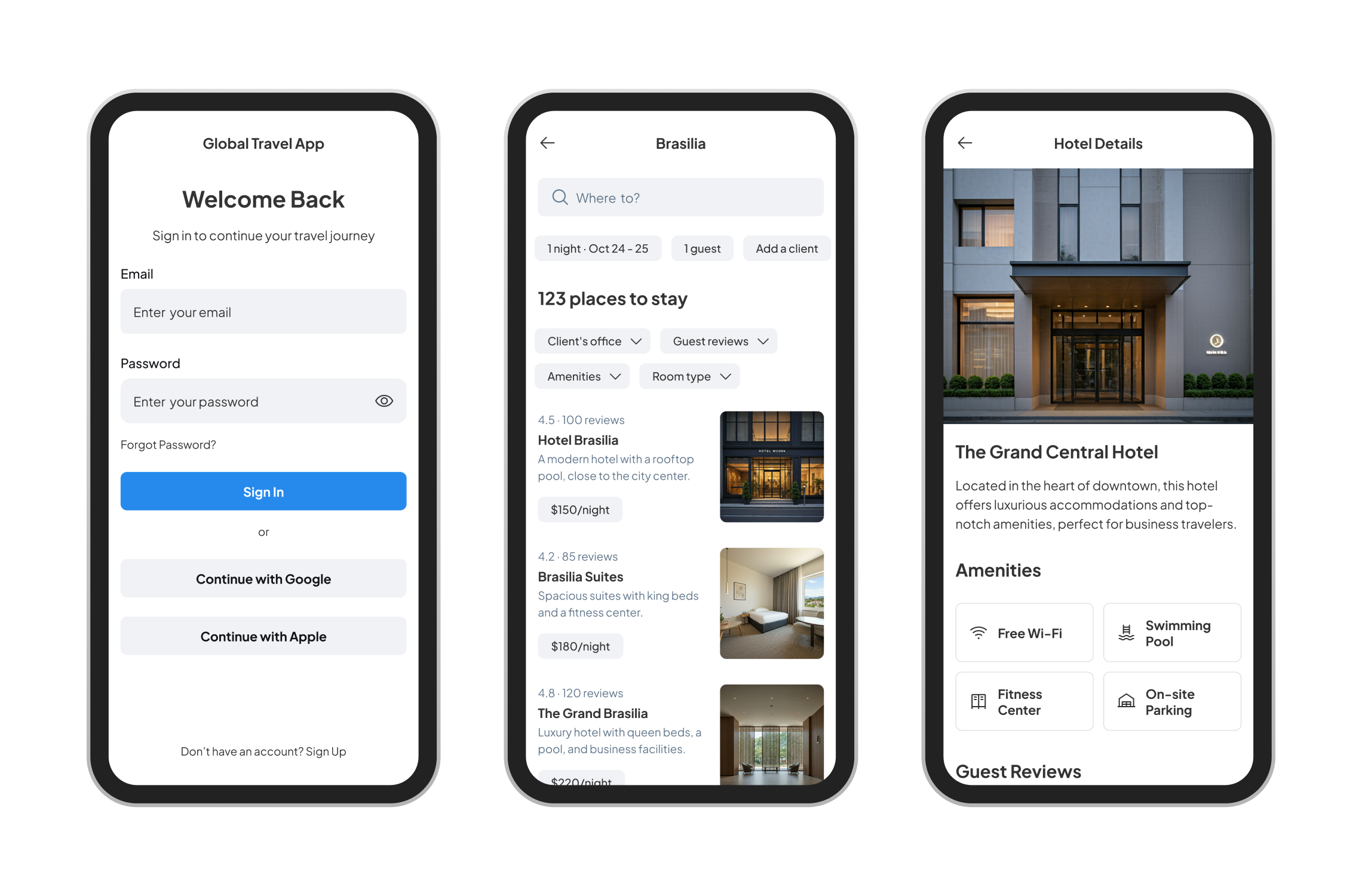
Wireframes
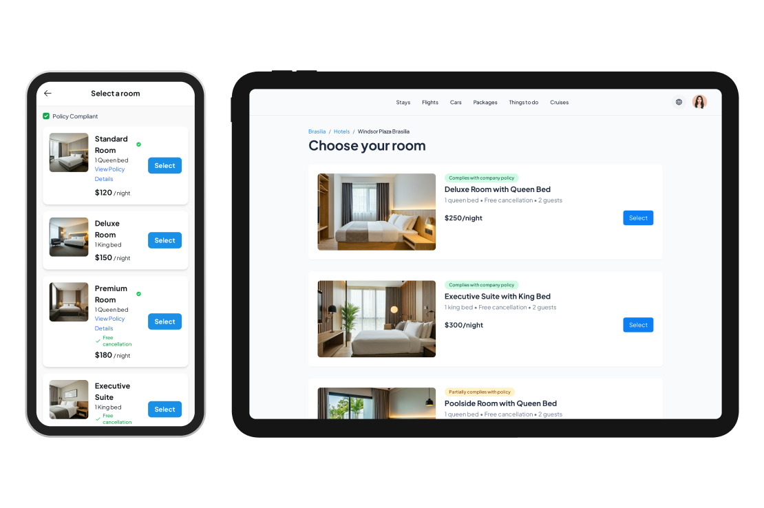
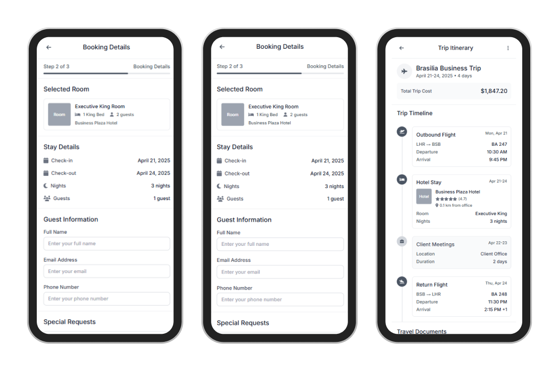
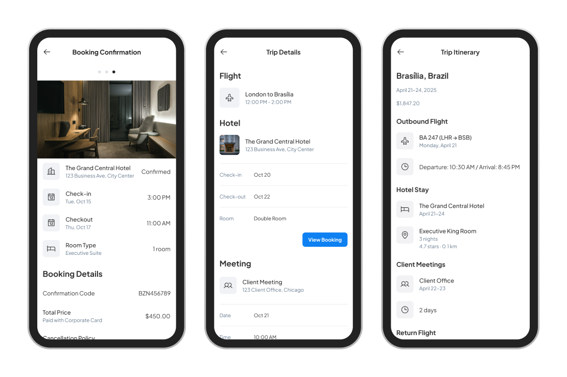
I produced low-fidelity wireframes to explore the revised structure. The new hotel listing page adopted a clean, organised layout that helped users compare options quickly. It prioritised consistent labelling, iconography and responsive filter behaviour. The room selection screen was also simplified, with each room type shown in a modular format that clearly highlighted differences in features, cost and cancellation policy.
I added subtle visual cues to guide the user through the flow, including completion indicators and reminders to review company travel policy. These wireframes aimed to reduce friction while maintaining the flexibility users needed to browse and adjust options before confirming their selection.
Visual design
Although the focus of this task was UX, I considered how the design would evolve visually within an existing system. I envisioned a neutral, calming interface with clear visual hierarchy and a focus on scannability. Typography and spacing were optimised for readability across devices, while icons were used sparingly to reinforce meaning without overwhelming the layout. The visual design would support rapid comprehension, which is especially valuable for time-sensitive business travellers.
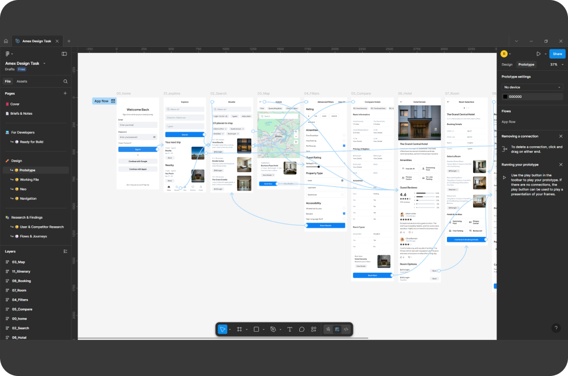
Prototyping
To bring the new flow to life, I created an interactive prototype in Figma. The prototype allowed users to complete a booking scenario, adjusting filters, comparing listings and selecting a room. It demonstrated how the revised journey would streamline the process for someone like Emma, letting her complete the booking in less time and with more confidence that her choice met both personal needs and company policy.
Impact
The proposed changes addressed the core usability problems while enhancing the platform's ability to support business travel at scale. For users like Emma, the redesigned flow made hotel booking faster, less stressful and more transparent. By surfacing relevant information earlier and reducing the risk of policy violations, the platform also reduced the burden on support teams and increased booking accuracy. For the business, these improvements would likely lead to greater user satisfaction, improved compliance and fewer booking errors — all of which contribute to operational efficiency and stronger client relationships.
Conclusion
This UX audit demonstrated how careful evaluation and user-centred design can reveal meaningful ways to improve even well-established workflows. By focusing on the specific needs of business travellers and aligning the experience with both personal preferences and corporate policy, I was able to propose a solution that delivers clarity, speed and confidence. The outcome reflects the power of practical, insight-driven design in complex digital environments.